

UPDATED MAY 10, 2019
What Is An Analytics Dashboard?
An analytics dashboard is a cloud-based reporting tool that shows the user their most important website metrics, such as sessions, conversions and engagement, in a glance. The visual display of data allows stakeholders to make data-driven decisions for their website and marketing efforts.
There are an increasing number of dashboard platforms on the internet. These platforms allow companies and marketers to identify important metrics (also known as Key Performance Indicators or KPIs) and display that data in a visual interface. Some people refer to the broader category of applications as Business Intelligence tools.
We use and recommend DataDeck and Google Data Studio.

Not all KPI metrics are related directly to a company’s cash flow. A business’ success depends on more than its balance of cash and debt; it depends on its relationship to its customers and employees. Some common nonfinancial KPIs include measures of foot traffic YOY or month over month, employee turnover, the number of repeat customers versus new customers, and various quality metrics. The specific metrics a company tracks are dictated by its current aims and may change over time as the business evolves, achieves old goals and sets new ones.
~ Investopedia
You know those signs on construction sites that say something like “152 days since the last safety incident”? Those are meant to convey important messages to a team, keeping everyone focused on a common vision, such as Safety First. On the web, dashboards can serve a similar purpose, keeping everyone focused on Transactions or Visitors or Call Response Time or units of blue widgets sold.
What metrics do I track on an analytics dashboard?
Decision makers should track the metrics that are most indicative of the health of the business, such as sales and leads. Secondary metrics such as traffic and bounce rate can also help drive good decision making.
While Google Analytics offers Dashboards that can be quite helpful and valuable, the third-party platforms (such as Datadeck, Geckoboard, ZoomCharts and Klipfolio) utilize APIs to allow users to pull in data from multiple sources, including Salesforce, MailChimp, AdWords, Google Sheets and many, many others.
We provide dashboards for all of our clients, and it was requested that we put together an explanation of what each of the metrics show. So following is a partial, by-no-means comprehensive explanation of some of the metrics we use and watch on a daily basis. Some of the nomenclature is mine to increase clarity. A couple of these elements are specific to Datadeck.
Date Ranges
In the title of each widget is the date range, expressed as follows (for example):
- (7D) – last seven days not including today
- (30D) – last thirty days not including today
- (1Y) – last 365 days not including today
Additionally (in Datadeck), there’s a button at top for “Widget date range.” With this setting selected, each individual widget on the dashboard will have its own date range set, be it a week or the last thirty days or some arbitrary custom date range.
Selecting “Dashboard date range” temporarily displays a selected date range across every widget uniformly. This can be particularly helpful for specific insights, such as “how did we do in the holiday season?” or “how did that Valentine’s Day campaign perform?”
Analytics Dashboard Metrics
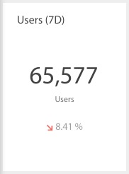
Users – represents the number of unique visitors to the site within the selected time range. Widgets with a single metric, such as total visits in the last 30 days, will usually display a percentage change below that number which would reflect the prior time period (the 30 days before the last 30 days).
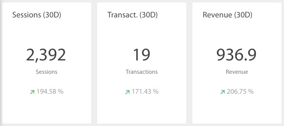
Visits – also known as Sessions. This number represents the total number of visits in the selected time range, where a single User may have multiple Visits. For instance, in the last seven days, Bob visits the site and returns the next day. That would count as two Visits.
Organic Visits and Visits / Organic Search – this represents the total number of visits from people who visited the site via organic search (Google, Bing and Yahoo, generally).
Lead Acquisition – this utilizes Google Analytics’ Goals and Conversions, which are often tied to engagement such as filling out a form or signing up for a newsletter. When combined with some third-party code, we can even use this method to track in-bound phone calls.
Ad spend can be used to calculate a Lead Acquisition Cost. Following is a sample model for determining Lead Acquisition Cost:
Ad Spend
Cost Per Click
Website Visits
Leads Acquired
Conversion Rate
Lead Acquisition Cost
$1,000
$0.80
1,250
50
4%
$20
Visits by Traffic Type show where visitors are coming from, represented in the Source / Medium format. Examples of Mediums include organic, cpc, banner and email. Examples of Sources including Google, AdWords, Facebook and SomeGuysBlog.com. There may be a fair amount of traffic labeled (direct) / (none), which may be visitors directly typing in your URL into the browser, accessing your site from a bookmark or not being tracked accurately due to certain security constraints. The general rule-of-thumb is that roughly half of the (direct) / (none) traffic is actually organic search.
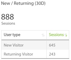
New/Returning Traffic shows a breakdown of who is new to the site and who is a returning visitor within the specific time period. Noting the specified time period is an important distinction. If someone visits the site every day, and the data shows the last seven days, then the first time this person visits in the specified time period will count that person as a new session and any subsequent visits in the time period will be counted as returning sessions.
Sessions by Age show a breakdown of the age range of visitors based on common demographics, i.e. age 45-54. Unless specified, this is for all traffic to the website, although it can be filtered for a specific channel or campaign.
Visits by Keyword shows organic search data, but it is very important to note that only about 5% of data is actually recovered, due to Google’s privacy policies. As a result of such thin data, many companies feel compelled to advertise on Google Ads to have better access to actual keyword data and how resulting traffic actually performs on the website.
Landing Pages represent the traffic to pages where people enter the site. For instance, a popular blog post might have a lot of Landing Page traffic, due to direct links to that blog post from social media or organic search traffic. This data can be cross-referenced with Web Position results, which can reveal opportunities to improve site content with the intent to rank better for search phrases that are already bringing in traffic.
Devices show a breakdown by desktop (which includes laptops), mobile and tablet. Mobile device info can be quite instructive, but the data may be a little fuzzy based on how the devices are identified – for instance, both “Apple iPhone” and “Apple iPhone 6s” may be listed.
Operating System data refers to the visitors’ device, be it a desktop, in which case, you’d see Windows, Macintosh or Linux, or mobile/tablet, in which case you’d expect to see iOS (Apple), Android (Google), Chrome OS or Windows Phone.
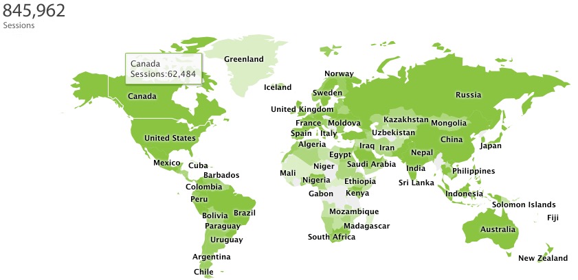
Geographic data is available at multiple levels, including:
* Continent, such as Europe
* Sub Continent, such as Western Europe
* Country / Territory, such as France
* Region, such as Provence-Alpes-Cote d’Azur
* Metro Area (USA only), such as Dallas-Ft. Worth TX
* City, such as Paris
This data is available throughout Google Analytics. For instance, it can be used to gauge performance on a banner ad campaign or to better understand where there is search traffic for a business with multiple physical locations.
Digital Advertising Dashboards
Marketers may organize their dashboards any which way, and this is often governed by the dashboard platform they are using, since pricing may limit the number of available dashboards.
I find it valuable to break out Google Ads (formerly AdWords), and have a separate dashboard from the one showing Analytics (as drawn from Google Analytics).
Impressions are a measure of how many times the ad appears on Google or on the network of sites that show Google ads in the selected date range.
Clicks are a measure of how many times the ad (or product listing or ad extension or phone number) was clicked in the selected date range.
Clickthrough Rate (CTR) is a simple formula: clicks / impressions. If there are 5 clicks on 100 impressions, then the clickthrough rate is 5%. Google takes this metric into consideration when running their real-time ad auction, so it is beneficial to manage ads and keywords with this in mind.
Spend (Cost) measures how much money is spent on clicks (or per acquisition) during the selected time period. Most Google Ads advertisers have a credit card on file, which is charged every $500 in spend.
Leads are one possible Goal, depending on what you offer and how you want to engage visitors. Similar to a transaction in ecommerce, we can measure the cost of lead acquisition, be it by form or phone or chat.
For instance, an advertiser spends $100 and receives 5 submitted forms, all of which are qualified. This would be a 5% conversion rate on lead acquisition at cost of $20 per lead.
Depending on (1) how many leads convert into customers and (2) the average lifetime value of a new customer, the decision can be made on what the acceptable lead acquisition cost is.
Keywords – this is based on comprehensive account data, unlike the small fraction of keyword data available via Google Analytics. In addition to overall volume of traffic each keyword phrase generates, we also want to know how well we convert that traffic. There are many ways to improve performance, including the bid, the ad, the landing page, the call-to-action, the value proposition, the price and much more.
We organize a Google Ads account primarily in a few ways.
Campaigns are the big umbrellas, where the budget is set and the broad topics are organized. For instance, a company may sell two different product lines and thus set up two campaigns, one for Widgets and one for Gadgets.
Ad Groups are a level down. So within the Widgets Campaign, we may have Ad Groups for Blue Widgets, Green Widgets, Vinyl Widgets and Benefits of Widgets.
Within an Ad Group are Ads and Keywords. Thus, in the Blue Widget Ad Group, we have perhaps a dozen keyword phrases related to blue widgets, a couple ads offering blue widgets and a click sends a visitor to a page on the site all about blue widgets. The more tightly that keywords, ads and landing page are aligned, the higher the clickthrough rate and commonly, we see a higher conversion rate at a lower acquisition cost.
Geographic data in Google Ads matches that in Analytics, as covered above. That said, the geo targeting ability in Google Ads is remarkable. An advertiser can choose by countries, states, regions, counties, cities, zip codes, polygons, radiuses and more. One client of ours is showing mobile ads to users within 10 miles of one of 2,000 major chain retail locations.
Of course, much of this applies to Facebook Ads as well, and we set up Dashboard Widgets for key Facebook metrics such as engagement, demographics, psychographics and more.
Analytics Dashboard Summary
There are a virtually endless number of ways to combine and look at data using analytics dashboards. The above metrics scratch the surface. When we look at dashboard metrics every day, we start noticing trends and thinking about our business from a data-driven standpoint. This results in new ways of thinking and questions that drive decision-making. For these reasons, we recommend creating and viewing dashboards, and sharing data in order to drive creativity and innovation.
Mercedes dashboard image courtesy Steve Glover / CC2.0
Construction site image courtesy Jakob Montrasio / CC2.0